

Edit: source with some more info
https://www.nytimes.com/interactive/2015/12/24/upshot/24up-family.html
I like that they have to use median, because I’m often having to find examples of why you’d use that over mean. My wife for instance is over 5k miles from her mom, and I imagine that’s true of most immigrants. So the skew is probably really, really strong if you didn’t use a non parametric measure like the median.
In other words, I’m stealing this for my stats class.
I like using both. An average of say 300 miles with a median of 5 miles would show you that there is significant bias toward the lower end.
I’m not a statistician but that’s my understanding of the two metrics
Yeah but you can’t really do that with a map. In a table you could. A report would likely report both, but also differentiate groups because you don’t usually want to report skewed data without explaining why.
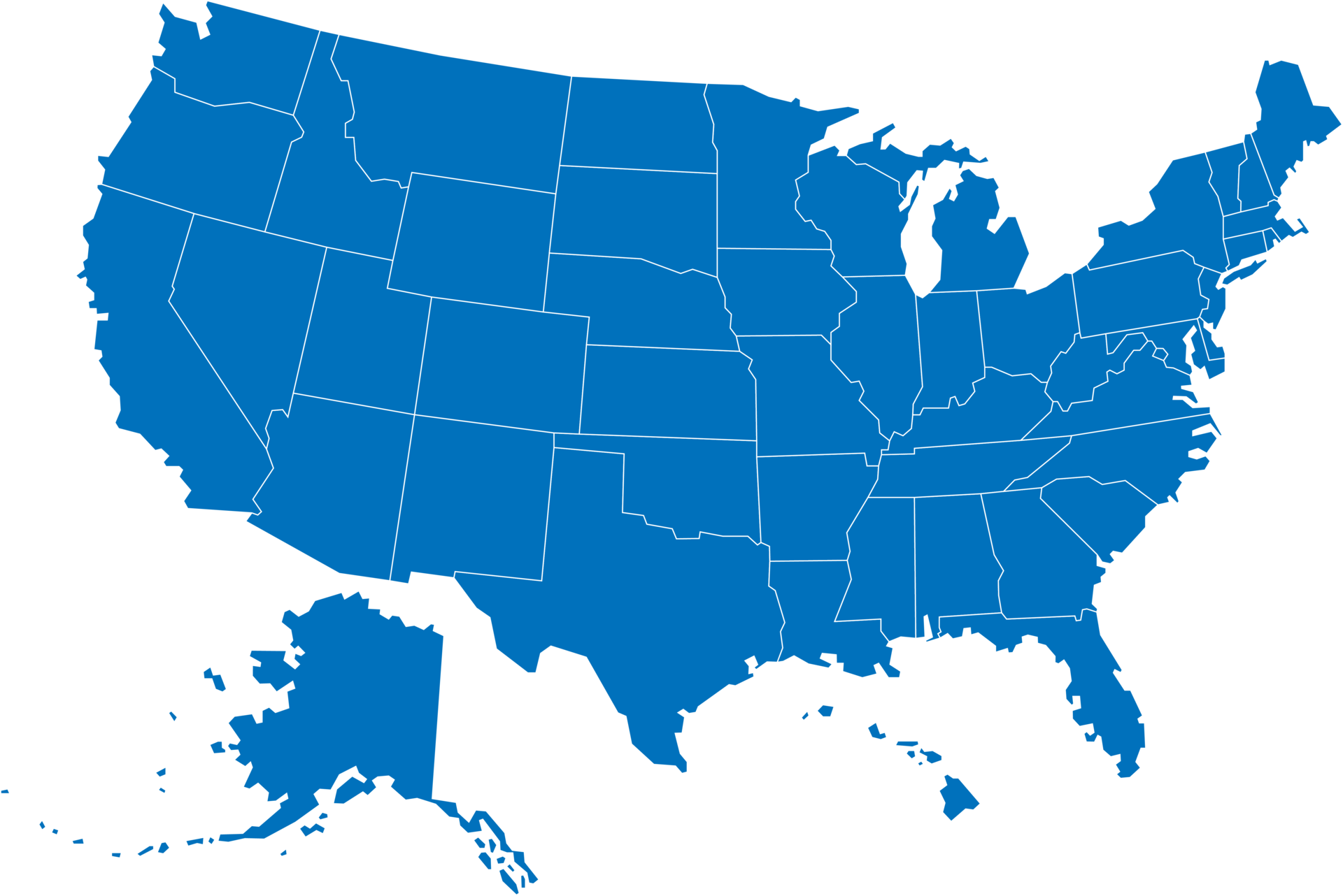
I bet if go down to county or city level, you‘ll find differently colored areas such as cities relying on old steel, coal, textile economies. At least here in Germany I know areas where many people left their home areas in the 90ies. But that’s probably a geography lesson.
Yup! And if you have the right dashboard you can usually drill down by location down to that level and even include those additional factors as an overlay. I used to do that using census and labor statistics data, and it is indeed very cool.
I live really close to my mom. She doesn’t live near me tho :(
My brain is trying hard to reconcile those two statements
Oh, shit, I connected the dots. I’m sorry
Coincidentally, 18 miles is almost exactly the maximum distance you can be from the sea and still be in Denmark.
Not advocating throwing your parents in the sea, just bragging about one of the advantages of living in a tiny country consisting mostly of sea and islands 😁
i will however advocate for throwing denmark in the sea
Nice
I’m thousands of miles
Hi, thousands of miles. Are you like, a hivemind of everyone named Miles or something?
Are you like, a hivemind of everyone named Miles or something?
That’s only like 3 people.
And this is in 2015, after we’d recovered from the great recession but before the housing/rental market forced a lot of families back into multi-generational housing situations.
Absolutely!
It’s probably also not uncommon for people who can work from home to have moved outward to lower cost-of-living areas during this time, but I bet that pales in comparison to the increase of young adults living with their parents.
Me: maps can be creative, but they can’t surprise me.
OP: hold my beer.
true enough for me when she was alive. except college I think the farthest out I was like 16 miles. I mean same with my dad though.
41 miles as the crow flies, 81 miles by car for me.
It would be interesting to scale this by population density
They mention a few major influences, and population density is one of them. In areas with more sprawl and land, it’s more likely for people to drive longer distances. (This probably explains the Midwest and West)
They also mention poverty being a factor, where it’s more common for families to live together, or very close, in order to help support each other. (so probably explains the South)
Another thing to consider is grandmothers helping when couples have young children. I bet if we overlayed a map of locations where people are more likely to have kids, we’d see a trend too.
It would be neat to have an interactive version where you can select different factors to control for, including pop. density, wealth level, children per family, etc.
See also: https://xkcd.com/1138/
Right, but that’s exactly my point, it likely wouldn’t just be one flat color. If you scale it by population density you get a map displaying the average distance between kids and parents compared to the average distance between any two people which I would expect to be 1. non-uniform and 2. more meaningful than raw kid-parent distance. The current map is useful and accurate, but I think the more interesting contributing factors are being drowned out by raw population density. Deciding what factors to control for (ie. pop. density, wealth level, etc.) results in a different meaningful outcome and is very important to consider when making conclusions based on the map. The image’s scale is probably too granular to do this analysis but if the raw data is finer-grained I would love to see a density-controlled version.
Right, but that’s exactly my point, it likely wouldn’t just be one flat color. If you scale it by population density you get a map displaying the average distance between kids and parents compared to the average distance between any two people which I would expect to be 1. non-uniform…
My point was that I expect exactly the opposite: that the average distance between kids and parents is pretty much exactly proportional to the average distance between any two people.
This is why we need the map! I’m curious which prediction would be accurate.
Hmm. And it pretty much just varies with density, looks like. What is that in terms of mom’s ranking on list of closest people?
Hmm, I live 3600 miles from mom. It sucks TBH.
Heavan is only 25 miles?
I can walk to my mom’s house in about 12 minutes.
Seems reasonable if you don’t move to another city
Most Americans live within an hour of where they grew up, so I’m not surprised. I think it’s bonkers, I mean there’s so much more out there, but from my own friend group yeah I’m the only one who moved away
I get it. My parents/hometown is a days travel away so I only visit ~two times a year. It’s hard to stay in touch with all your old friends when you rarely see them. If you’re just an hour away it’s much easier to keep touch with your old circle.


