

This toggle is annoying because what was once 1 press to turn on BT is now 2. It gets me every day.
Same bullshit they did when they combined WiFi and Cell into one toggle and called it “internet”.
Like DO YOU PEOPLE JUST NOT UNDERSTAND THE PURPOSE OF THIS MENU YOU YOURSELVES CREATED!?
What’s even more infuriating is that the panel is blue even if both wifi and cell network are tuned off!
That’s a major improvement. Nobody turns off Bluetooth.
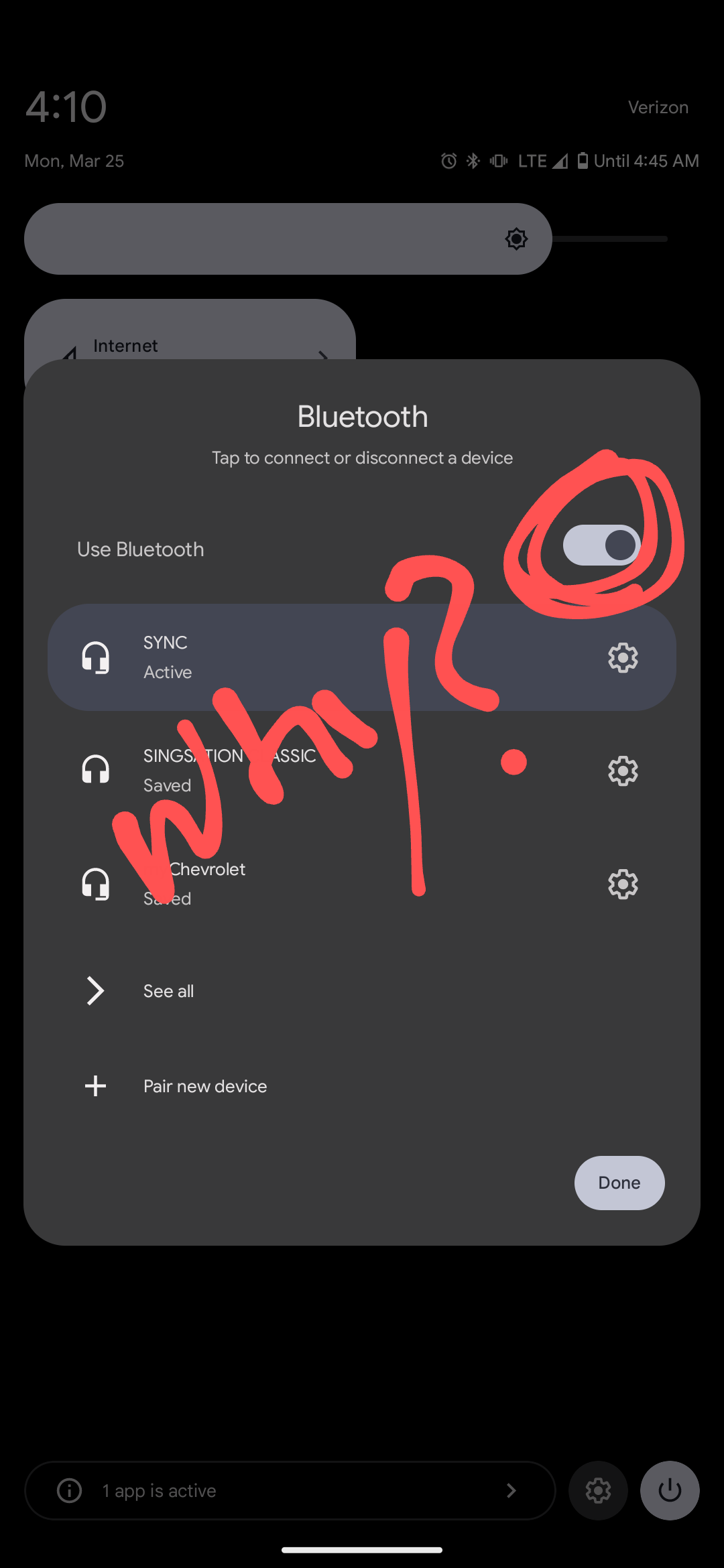
It’s now easier to check or disconnect devices.
 I like the way Nothing OS does it. Tapping the icon toggles Bluetooth on/off, and tapping the text/rest of the button opens the popup.
But the wifi button still pisses me off. I want my separate LTE data toggle back.
I actually have separate buttons for WiFi and data but they were buried in the ‘edit’ list
Not in stock Android 14 / AOSP
I thought Lineage OS was pretty close to AOSP, interesting to discover the things which have been added
Yes the buttons and the “long press power button on display off for flashlight” both small but soo useful things
Gad damn, I use that all the time!
Yup, an issue on the GrapheneOS issue tracker was closed, to implement this feature. Maybe giving it another try might help? Its damn useful and smart, as this has no function
It follows the pattern for WiFi/Internet.
I honestly thought this was my own doing and was about to go insane when I couldn’t find the setting to revert this. Why on earth would they do this…
I’ve felt this a lot over the years. Regressions in interface designs happen here and there, and I feel it’s just people justifying their jobs. We have to change this, and that, and EVERYTHING, to keep it fresh. Where in reality, sometimes only some things need changing.


