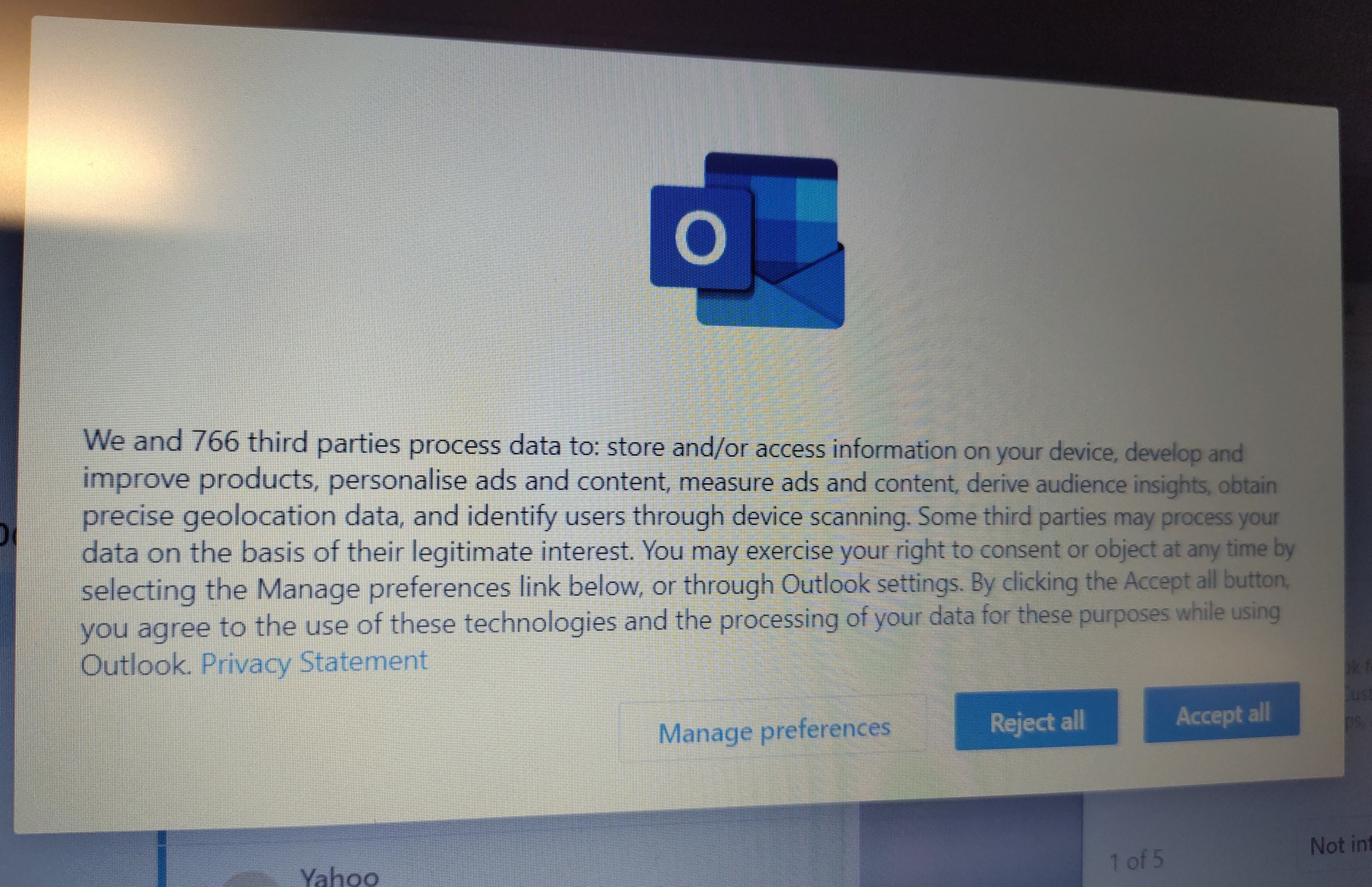
With dark patterns you can “guide” the user to click a particular button, for example by having “accept” in a large, bright stand out colored button, and the “reject” button in a low contrast, small or disabled looking button.
This will not prevent people from clicking reject, but it shifts the percentage of people clicking accept vs reject in the websites favor.

I’ve been a software developer for nearly 25 years now, and I can tell you this.
No cunt reads anything.
Something pops up over the top of what they want, they’ll click OK.
With dark patterns you can “guide” the user to click a particular button, for example by having “accept” in a large, bright stand out colored button, and the “reject” button in a low contrast, small or disabled looking button.
This will not prevent people from clicking reject, but it shifts the percentage of people clicking accept vs reject in the websites favor.