Hi! Loving Jerboa and Lemmy in general, and the latest updates have really improved the experience for me. I had two thoughts for potential improvements that I figured I’d float, and could make a GitHub ticket if they seemed like good things to implement:
- I love the list view, but I find very often that if the post title is only one line tall it is very easy to accidentally click whatever is directly below it. If it’s possible, a little extra padding to the selectable area for the post title would be great (even if it’s not visible padding and just some coding trickery)
- I wouldn’t mind an option to hide community and user icons on a post within my feed (for a cleaner/more compact look), while still showing user icons once I’m in comment view (maybe I missed this option?)
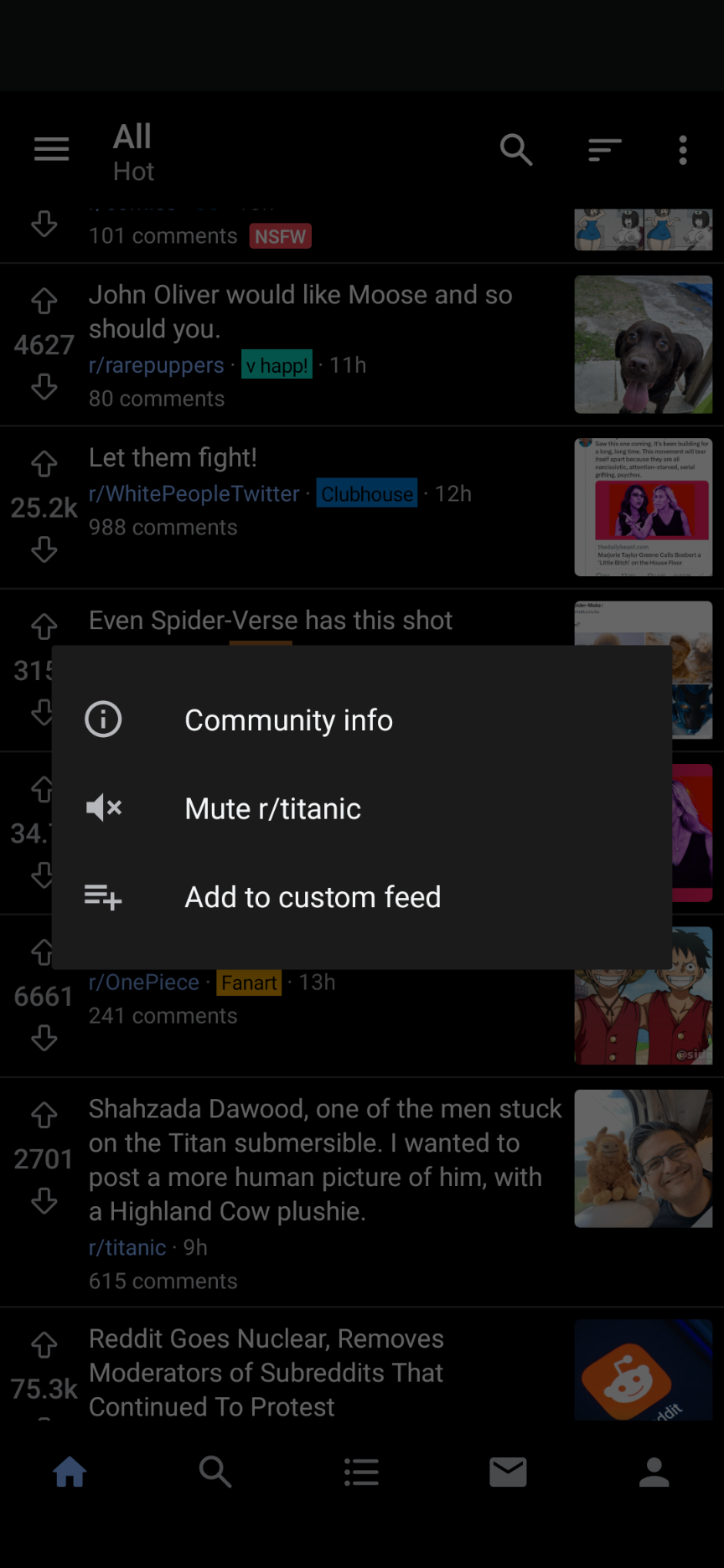
- One of my most used features coming from Boost for Reddit was the ability to long-press the community for a given post and get a popup menu, from which I could block/mute said community from my feeds without having to actually click through. If this is possible to implement that would be AMAZING. Screenshot attached:

If it’s better to file these in GitHub I can do that :) thanks again for a great app!


Totally agree! I was so happy when I saw the navigation arrows for the comments but I also saw that holding the up-arrow to get back to the original post would greatly improve the experience (that was my standard form of navigation in Boost as well).
Edit: I guess long pressing the up-arrow was like the “Home-key” and down-arrow like the “End-key” on a Keyboard