lnxtx@feddit.nl to 196@lemmy.blahaj.zoneEnglish · 1 month agoVal(r)u(l)efeddit.nlimagemessage-square17fedilinkarrow-up1117arrow-down19
arrow-up1108arrow-down1imageVal(r)u(l)efeddit.nllnxtx@feddit.nl to 196@lemmy.blahaj.zoneEnglish · 1 month agomessage-square17fedilink
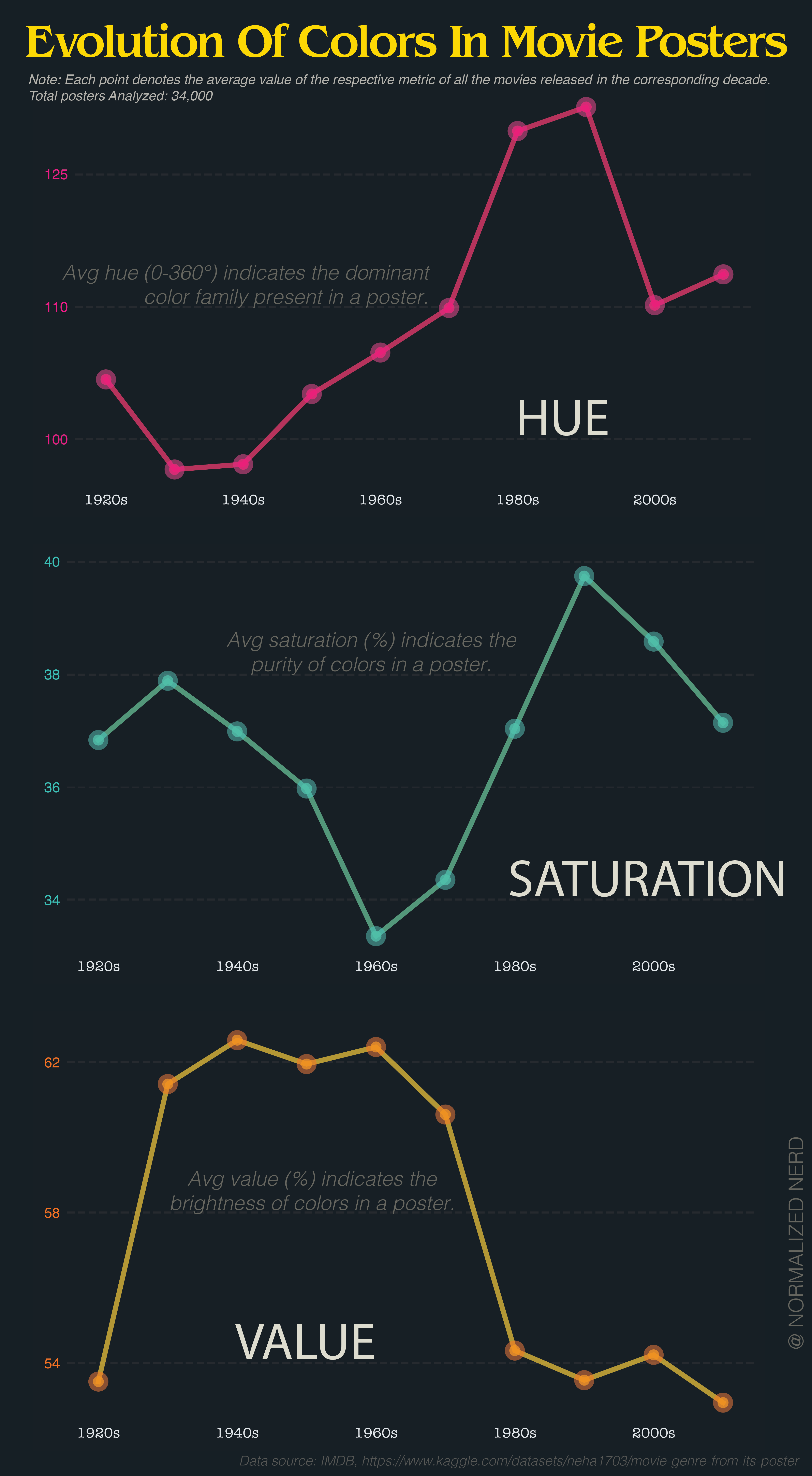
minus-squarebob_lemonlinkfedilinkarrow-up17·30 days agoThe problem is that averaging hue makes no sense at all because hue is not a longest scale. If you take a red poster (0) and a blue poster (240), it averages to green. Or take red (0) and red (359), averaging to cyan (180).
minus-squareflying_sheep@lemmy.mllinkfedilinkarrow-up7·30 days agoThe average of 0° and 359° is obviously 359.5°. it’s a radial scale.
minus-squarebob_lemonlinkfedilinkarrow-up9·30 days agoBy that logic, the average of red and cyan is both purple and lime. Still useless.
minus-squareflying_sheep@lemmy.mllinkfedilinkarrow-up2arrow-down1·30 days agoNot if there is a clear trend. If most movie posters are blue, three average will be blue. But i agree, it is useless if there is no clear trend.
minus-squareStarbuncle@lemmy.calinkfedilinkEnglisharrow-up5·29 days agoI wouldn’t trust someone who tried to visualize hue like this to make that calculation correctly.
minus-squareStarbuncle@lemmy.calinkfedilinkEnglisharrow-up2·29 days agoIt would have made more sense if they had shown the distribution of hue as a polar graph and just had one every decade to show how it changes over time.


The problem is that averaging hue makes no sense at all because hue is not a longest scale.
If you take a red poster (0) and a blue poster (240), it averages to green. Or take red (0) and red (359), averaging to cyan (180).
The average of 0° and 359° is obviously 359.5°.
it’s a radial scale.
By that logic, the average of red and cyan is both purple and lime. Still useless.
Not if there is a clear trend. If most movie posters are blue, three average will be blue.
But i agree, it is useless if there is no clear trend.
I wouldn’t trust someone who tried to visualize hue like this to make that calculation correctly.
You know what, I completely agree.
It would have made more sense if they had shown the distribution of hue as a polar graph and just had one every decade to show how it changes over time.