

Anyone who thinks that these three have the worst UI possible has never had to deal with a really bad UI. Try Sharepoint on for size. Or Azure. Or Jira. And there’s likely still way worse stuff than those.
The UI of Youtube is actually not bad. What is bad is how the search function has gone to shit, constant promotion of youtube Shorts taking up half the screen, and the algorithm getting steadily worse at recommending videos.
The interface itself is pretty easy to navigate.I do feel like the mobile app has been getting progressively buggier over the last year. Maybe it’s just me but the mini-player has been glitching out for months and other weird stuff has been getting more prevalent like yesterday I had the YouTube play button icon stretched and distorted as an overly across the whole app until I restarted it and creating a queue didn’t work until I started a new video manually.
I hate the app so much, it always starts to play random shit while I’m just browsing/searching.
The secret ingredient is enshittification.
add whatsapp web to the list
But it’s like the most basic chat app? List of chats on the left and the rest is your current chat. How is that bad UI?
SAP: “Step aside, kids”
Guess it doesn’t look like this anymore:

Hahahahaha. I hate SAP with a burning fury. I’m not sure if it’s looked like this for a long time as I’ve only been in my career three years, but yep yep yep yep, looks exactly the same.
Then it’s looked like that for at least a decade, nice.
Imagine they have new versions with new UIs, but legacy businesses ain’t gonna pay for those upgrades and retraining and re-integration costs!
Then it’s looked like that for at least a decade, nice.
Imagine they have new versions with new UIs, but legacy businesses ain’t gonna pay for those upgrades and retraining and re-integration costs!
Imagine that they want every customer to move to their new “cloud” system, S/4HANA, come hell or high water. Because that’s happening, apparently.
What’s bad about discord?
Hate how it replaced forums. Compared to forums it’s the absolute worst. I will never not hate it. It’s alright for basic voice chat with friends. Anything beyond that? Just shoot me in the knee instead pls
Haha, you think those are bad? Try any professional tools, like CAD’s, DAW’s, or 3d modelling software.
Or, even worse, any internal corporate software, the bigger and the older the company is, the better… at being the worst, that is.
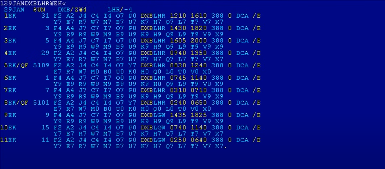
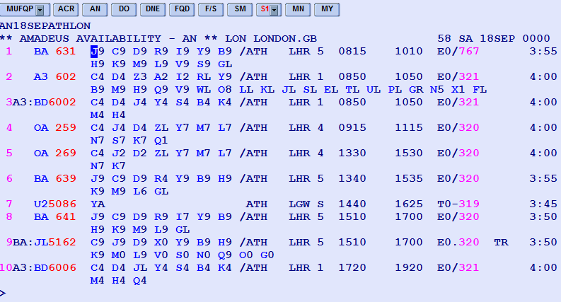
Or. actually, just go to an any airline’s office to buy a ticket and witness the atrocity they have on their monitors. No, those are not blue screens of death. That bunch of gibberish is the actual UI. And the only way to interact with it is by typing in commands that read like something that Lovecraftian creatures would sound like.
Those systems are so much faster and more reliable than the bubbly shit we have now. All that crap on the screen is what we call “information density.” It’s designed for people who work with it several hours a day and understand it, not for some random to be able to learn in 15 minutes. It has a longer learning curve, but is way more efficient in the end.
I agree. That stuff tends to be much more stable than the newy swipe-and-drag interfaces. These designs are basically unbreakable. I dig that so.
Command line isn’t actually bad UI for professionals. It’s way faster than using a mouse.
For YouTube, use FreeTube, Tubular or LibreTube if you like native clients or Piped and Invidious if you prefer a website.
It’s best not to use Reddit at all, but if you need it for some reason, check out Libreddit or this site
Unfortunately not much can be done to avoid Discord’s terrible UI other than not using it. The Matrix protocol and Element client are pretty nice alternatives.
Discord is easy, I just it for voice chat with friends exclusively. The rest of discord is what you get when you explain forums to someone, bash them over the head 1000 times, then let them program a forum. I could not think of a single thing they could make even worse.
The discord UI was great. And then they made it ugly and slow as fuck.
I’ve been using aliucord
Thanks a lot for that tip. The UI is Vetter and its also mich faster.
They all want to give you just enough control to make you think you chose what their algorithm recommended for you.
It’s actually optimized for them. The goal is to get users to spend time and see ads etc. The UI is not made for us users.
There are no ads in discord, there’s really no point to force the new UI on everyone.


