You can’t remove things from it, you cannot rearrange it… Useless things and suggestions get stuck at the top.
I’m on Android 13. Have they made any improvements in the newer versions of Android?
Mine has an ex from a decade ago at the top of the list. I haven’t communicated with that woman in years.
Same. I always have to dig to find kde connect but for some reason my ex will stay number one for all eternity.
When UI/UX was becoming the hot ticket in the late 90s/early 00s, the lesson always beaten into your head was to make navigating simpler, with the fewest clicks possible. Now they bury everything.
YouTube used to let you make playlists on the fly, now you have to click into a small sub menu that is hard to touch without stopping the current video. Even disconnecting from a network is now an extra click than it used to. Google designers have totally lost the point. They are the reason people pay more for less with an apple phone.
Don’t even try to find your YouTube music or video play history in a rational way. It’s in your profile! W T F .
It’s literally one
clicktap, and I found it first try…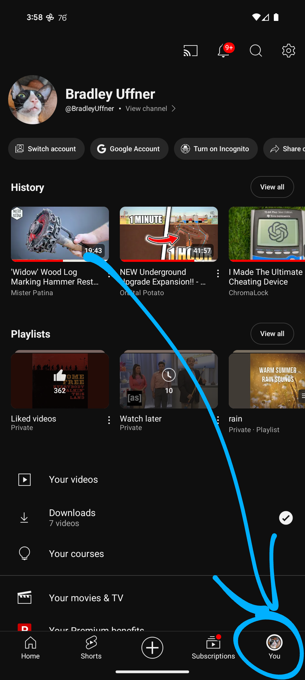
Break it so they can take credit for fixing it
Android 14 here, no improvements at all
Please, you need to be more specific. Android has half a dozen distinctly different share menus, and there are distinctly different reasons why each one is garbage.
It’s genuinely ridiculous because they keep talking about fixing it every android version, and then like nothing changes?
Dark patterns maybe. Gotta make it hard to share to Tubular etc.
I can never work out with google what is malice and what is incompetence.
Just make it your default app for YT links.
no, if anything it’s gotten worse
I was literally just bitching about this very thing to my wife this morning. It’s a hot mess, and proves someone(s) at Google are severely incompetent.
Google used to be best of the best; now, it seems, they hire only script kiddies.
Some more comments & jokes on this thread from a few months ago. I feel your pain @Wistful@discuss.tchncs.de
For me the worse thing is when I copy some text and that small pop-up appears (Andr##d 13). I don’t like it because I end up misclicking it and opens up some menu. I hope there’s an option to turn it off.

14 here. Still shite.
Not sure if this is new in 14, but you used to have to select an app first, then select the contact in that app. Now apps can present the contacts to the share menu directly so no double tap. Funnily enough, Google Chat was the last app on my phone to support this feature.
Pretty sure it’s been like that for a while, I have the same on 12. And it must be great at predicting who I want to share with so that it consistently DOESN’T show them in that list.
Manufacturer skins have long provided customisation for the Share menu. The stock experience has never been good.
