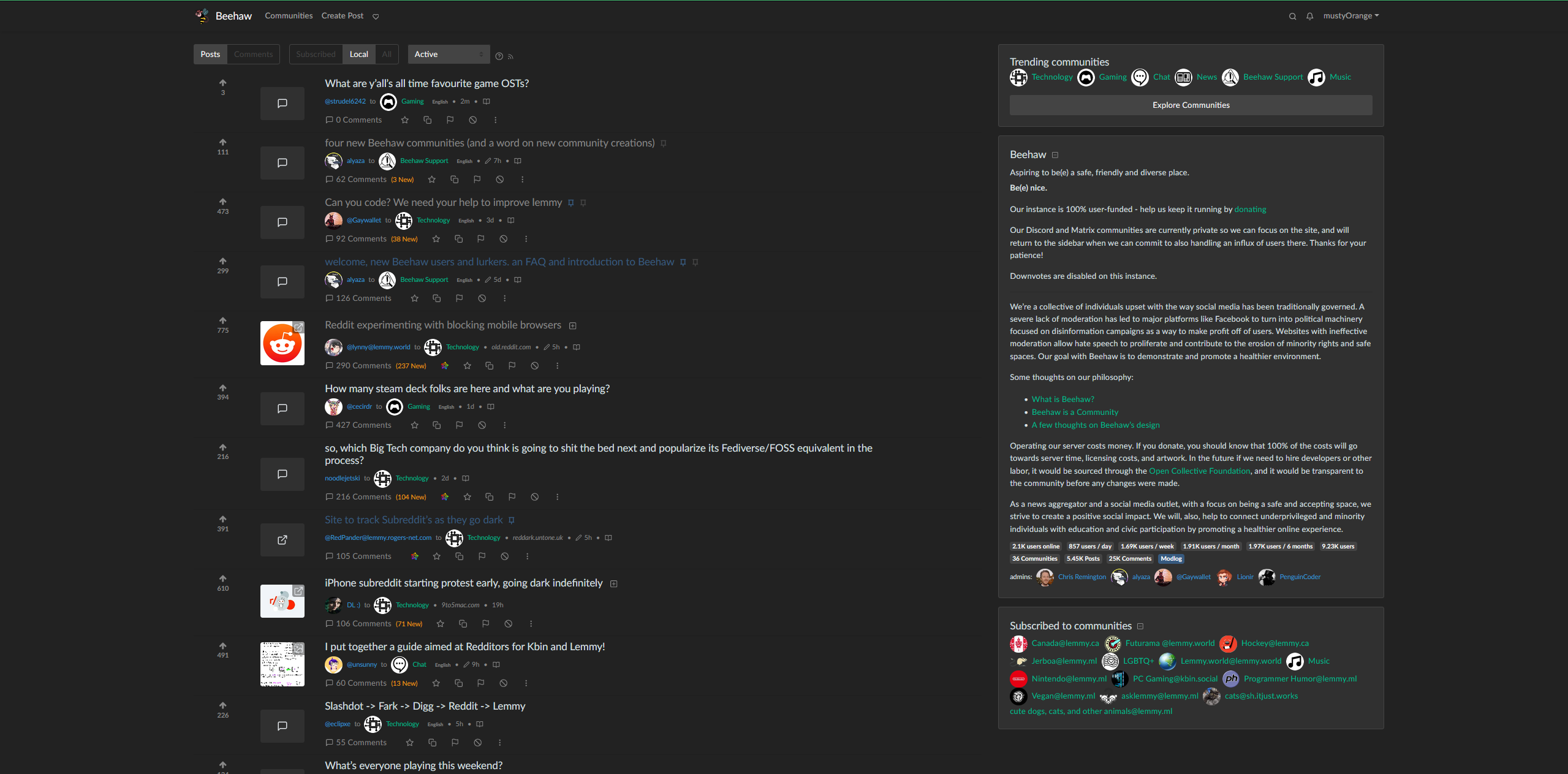
cross-posted from: https://beehaw.org/post/511971
Not sure if this is the right community, but the narrowness of the default web page was driving me a little crazy. I still need to fix a few things (like vertically centering the votes) but I feel that this looks a lot better. If you have the Stylus browser add on, you should just be able to copy and paste this into a new style


UserStyles link: https://userstyles.world/style/10309/densify-for-beehaw-org
@media (min-width:1400px) {
       .container,
       .container-lg,
       .container-md,
       .container-sm,
       .container-xl {
           max-width: 2200px;
       }
       .col-sm-2 {
           flex: 0 0 8%;
           max-width: 8%;
           display: flex;
           align-items: center;
           text-align: center;
       }
   }

   h5 {
       margin-bottom: .05rem!important;
   }
   .thumbnail {
       object-fit: cover;
       min-height: 60px;
       max-height: 80px;
       max-width: 80px;
       min-width: 80px;
       width: 100%;
   }
   .btn-block {
       margin-top: 1rem!important;
   }
   .mb-1,
   .my-1 {
       margin-top: .3rem!important;
       margin-bottom: .3rem!important;
   }
   .my-3 {
       margin-top: .3rem!important;
       margin-bottom: .5rem!important;
   }

   .vote-bar {
       min-width: 80px;
   }
You must log in or register to comment.
Thanks, ill try it out later. As someone else suggested already, maybe this is of interest to the devs of lemmy As well.


