cross-posted from: https://lemmy.world/post/18008132

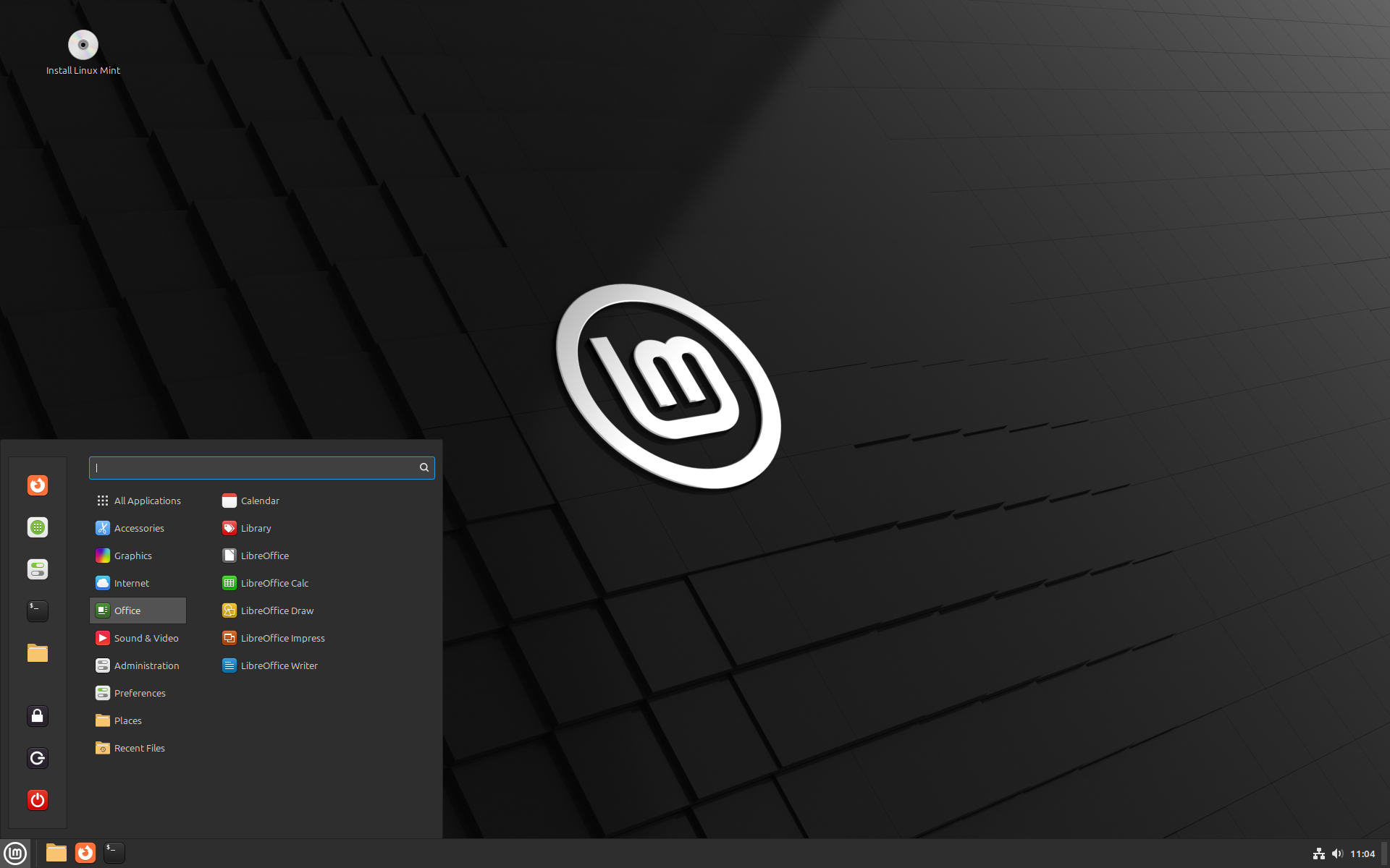
The Linux Mint team has just released Linux Mint 22, a new major version of the free Linux distribution. With Windows 10’s end of support coming up quickly next year, at least some users may consider making the switch to Linux.

While there are other options, paying Microsoft for extended support or upgrading to Windows 11, these options are not available for all users or desirable.

Linux Mint 22 is a long-term service release. Means, it is supported until 2029. Unlike Microsoft, which made drastic changes to the system requirements of Windows 11 to lock out millions of devices from upgrading to the new version, Linux Mint will continue to work on older hardware, even after 2029.

Here are the core changes in Linux Mint 22:

  • Based on the new Ubuntu 24.04 package base.
  • Kernel version is 6.8.
  • Software Manager loads faster and has improved multi-threading.
  • Unverified Flatpaks are disabled by default.
  • Preinstalled Matrix Web App for using chat networks.
  • Improved language support removes any language not selected by the user after installation to save disk space.
  • Several under-the-hood changes that update libraries or software.
  • Shareni@programming.dev
    link
    fedilink
    arrow-up
    3
    ·
    4 months ago

    It’s the only distro I’ve dropped because the upgrade was

    1. Hidden and I had to accidentally open its homepage to find out
    2. Instructions came with lines you needed to execute before first upgrading
    3. Completely dropped gnome, and removed all previous customisation

    Worst upgrade experience ever…

    • DarkThoughts@fedia.io
      link
      fedilink
      arrow-up
      2
      ·
      4 months ago
      1. What does that even mean? How was it hidden? How does one “accidentally” open a homepage?
      2. Huh? You mean when they had some changes to their system structure? How’s that a problem?
      3. Gnome is a shit heap of a desktop environment and the buggiest fucking shit I had to touch in Linux - and I’m using KDE, so that’s saying something. And that comes on top of its lack of any usability from being so minimalistic to the point of being virtually handicapped. I don’t even comprehend how people can use it. Absolute worst and most broken desktop environment out there.
      • Shareni@programming.dev
        link
        fedilink
        arrow-up
        4
        ·
        4 months ago
        1. Meaning there’s no obvious glowing button to upgrade, like on every stable distro I’ve used. By realising fedora got a new release 2 months ago, asking why the hell am I still on the previous one, and going to the homepage.
        2. How is needing to run arbitrary code you copy-pasted less hassle?
        3. Your opinion on it doesn’t matter, completely axing the previous default without a transitional period is neither hassle-free nor inspiring confidence. Also, that config was anything but minimalist…
        • DarkThoughts@fedia.io
          link
          fedilink
          arrow-up
          1
          arrow-down
          1
          ·
          4 months ago
          1. Never had this on any distro before, including Mint. Always had to do a full re-install. Maybe that changed over the years but at least back then when I hopped through LTS distros this was absolutely not the norm.
          2. I’m sorry but your sentences make 0 sense.
          3. I’m talking about Gnome’s features, which are downright insufficient. But that doesn’t even matter when every Gnome app crashes constantly, including the file explorer.