TL;DW:
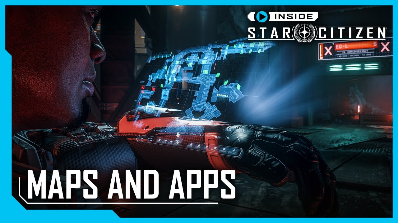
- Complete overhaul of mobiGlas, moved to “Building Blocks” & “Cards” system
- New home panel displays:
- Tracked missions
- Notifications
- Reputation & crime stat
- Status of connected ship (ammo, fuel)
- Environment data (gravity, atmo, pressure, temperature, radiation)
- Health data (overall %, temperature, heart rate, suit fuel & oxygen)
- Some app updates won’t make it to 3.23 (chat, vehicle customization)
- Health app displays everything home screen does as well as:
- Conditions effects (injury status)
- Active drugs
- Hunger & thirst
- Blood drug level
- Contract manager changes:
- Toggle between legal/illegal missions instead of separate tabs
- “Mark all as read” button
- Star map changes:
- Now responsible for everything (space and locations)
- Local map has a clickable list of available points of interest (shops, transit, hospitals etc)
- GPS routing
- Custom markers
- Mission markers
- Will be able to navigate between zones (ex. needing to travel via trams) but there are some issues that require fixing first
- Space part contains all the info available until now, plus
- Clicking on a space location (like space station) displays info about available POIs (stores, landing options etc)
- Improved feedback when routing between space locations
- Search bar
- Marker list
- HUD shows level of injuries to each body part
CIG asked for feedback on HUD readability, drop by on Spectrum if you have something to add.
You must log in or register to comment.
Lots of places even on their showcase were the text becomes almost unreadable. Not just on the star map even in the standard mobi glass windows. i.e. against the illuminated store logo. Why is CIG so vehemently opposed to readable UI? At some point legibility has to come before the coolness factor of blue holograms.


