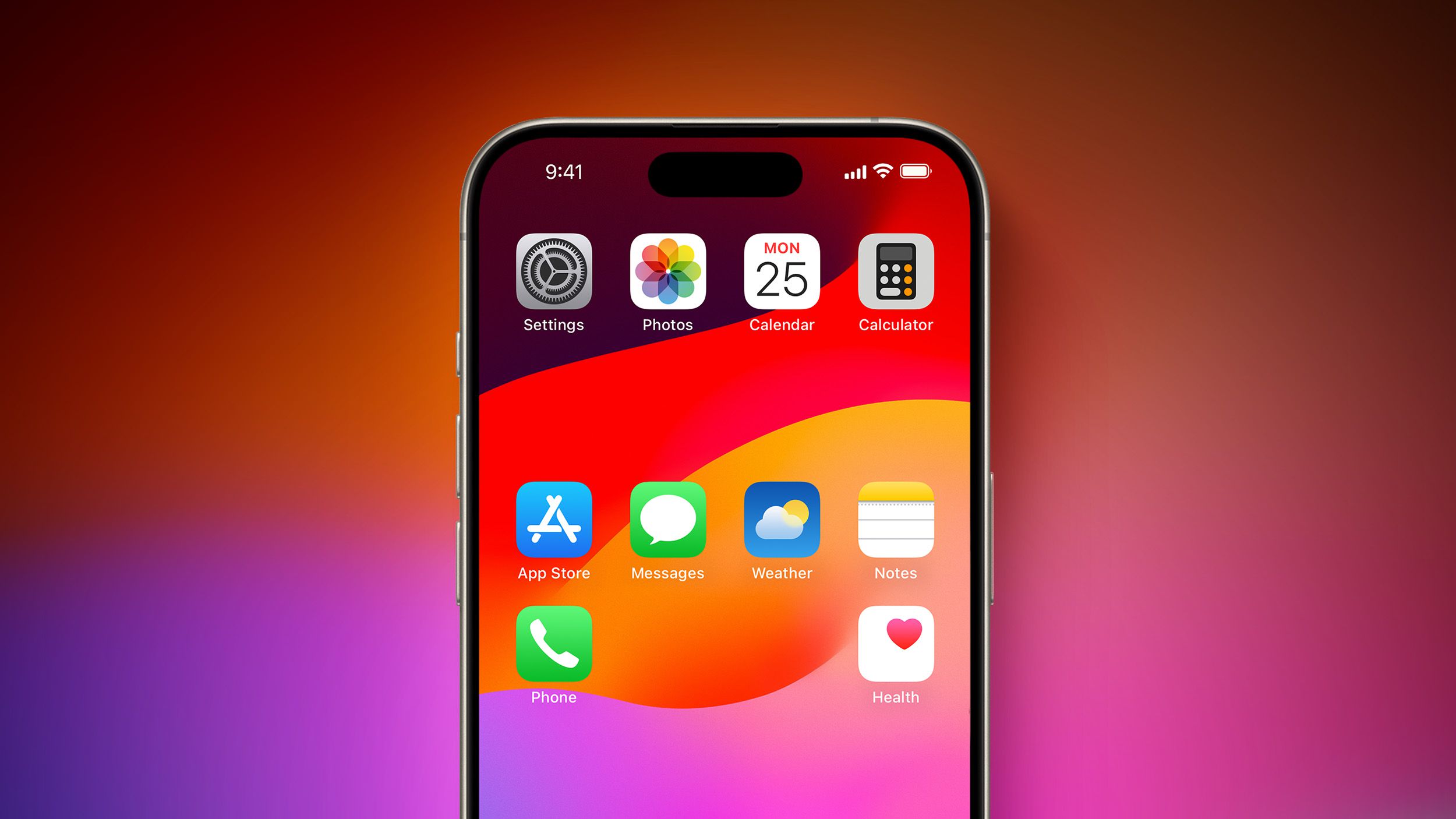
this is an unpopular opinion but i know the aesthetic reason for apple not implementing this for so long, and like eveything, it’s to make money.
android design is pretty good, but user created android phones home screens can often look pretty hateful, often with 4-6 screens of more empty space than icons, tons of widgets with an inconsistent design scheme, random half empty folders and a notification bar overcrowded with overshrunk icons. android phones often look like old Windows XP desktops—even on flagship distributions.
in contrast to google, apple cares what your phone looks like because they have a highly visual brand.
apple, by not allowing placement anywhere intentionally enforced a consistent top-left to bottom-right aesthetic which is now ubiquitous to the brand. among other design decisions, the result is that when you blur your eyes and look at a phone home screen you can tell whether it is apple or not.
- but the functionality is worse, yes i know.
- but it actually does look worse too, to you maybe, but not to apple. my belief is they did this for the same reason they put the magic mouse’s lighting port on the bottom (to keep users from always using it plugged in. which looks “ugly”).
the power of a strong and unmistakable brand is incomparable. in many cases, the value of a brand can even outperform raw product utility when it comes to customer satisfaction, a theory which i believe apple has been leveraging in this case very much intentionally despite the seeming paradox of utility.
edit: already getting downvoted to heck i should have known better than to be aware of basic marketing principles lol. i promise you im not defending apple im just explaining why they did this to make more money.
I have to disagree on one point – that iOS home screens somehow look more orderly because they’re full of icons arranged in a strict top-left-to-bottom-right fashion. It doesn’t look any less cluttered than an overly full Windows desktop.
I found desktops that limit themselves to core functionality and maybe a nice wallpaper to be better looking and more usable since the days of Windows 95 and that hasn’t changed since.
That “strict grid of icons” look certainly is uniform across iDevices and that’s what appeals to Apple but I never found it to be particularly attractive.
Every modern release of iOS is more like Android, and every modern release of Android is more like iOS. Welcome to convergent evolution.
By 2030, the only major difference between Android and iOS will be that, when you hit the bottom of a scrolling page, one will be a little bouncy and the other will be a little stretchy.
People will still fight over which OS is the best.
Bullshit, by 2030 everything will be doomscrollable thanks to generative text AI. Our marketing department has done some research and concluded that our customers will stop using their device if they hit the bottom.


