

Bojack Horseman S4E4 “Commence Fracking”

You mean we’ve seen these memes before? How many times?
Tangentially related: while making this, I got to mess with a filter setting called “phase shift”

GIMP BOSS LOVE TO SEE IT
You should also try to reverse the polarity, that‘s a good trick.
Don’t do that because it will send you into a time loop
You mean we could have seen this meme a dozen times before?
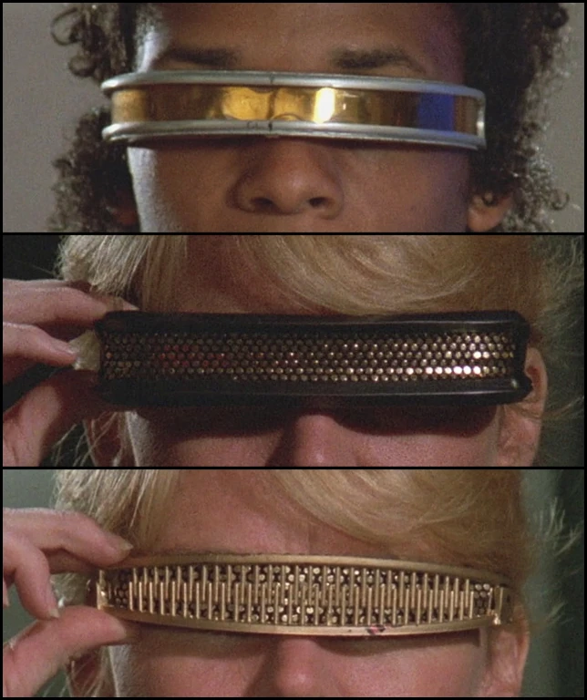
Don’t forget to look for the number 3.
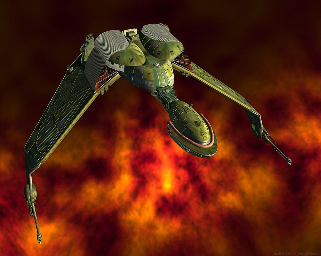
I am reminded of all the times they are using the viewscreen to look at something the sensors can’t identify but isn’t exactly invisible so all they see out the “window” is some space fog and have always wondered: do they not have, like, actual cameras? A ship using its shields to make it look like a cloud of radiation on sensors should still be visible to the naked eye, right?
Very cool! I’d love to get good at gimp, solely for memes. It’s a bit overwhelming.
I wish I had any good advice other than just “do it”. Next time you need to make a meme, open GIMP first, and each time you get stuck trying to do something that you cannot figure out among the million submenus available, search online for how it is done. Most of the time, someone else has already posted on StackOverflow or something asking how to do that very same thing. Eventually, you will rely on outside help less and less.
EDIT: Just looking up “make meme with gimp” seems to come up with some good basic tutorials, though some are quite old and outdated. The one thing that I do not agree with in any that I had checked is their various methods for adding an outline to text. I like to use the Drop Shadow filter to do so. Select your text layer > click Filters (in the menu bar at the top of the window) > Light and Shadow > Drop Shadow. In the dialog window that appears, set the following values:
- X:
0 - Y:
0 - Blur radius:
1.00 - Grow radius:
10 - Opacity:
1.000(or whatever the maximum value is in your version of GIMP)
Depending on the font size of your text, play around with the blur radius and grow radius until it looks good to you.

You are a legend.
Thanks for sharing this.
“just do it” is probably the best advice, honestly. I remember starting a video about GIMP sometime last year, but I turned it off after I realized that I wasn’t retaining most of it. I’m very much a “start and look it up as I hit snags” type of learner, which seems like what you’re describing too.
I started going down the Gimp rabbit hole after they released 3.0 a few weeks ago. I attempted it years ago (before there was a one-window mode) and never stuck with it long enough. I’m getting adept slowly
- X:
I’m proud of this community
What time loops? How can you tell how many times it’s happened?

What time loops? How can you tell how many times it’s happened?
I should write a script to count Blazin’ Bev vs Time Loop; I think Loop won by sheer volume.
How might one even do that? It’s not like the post title, comments, etc. reliably indicate the subject of the post.
shrug
I haven’t really thought about it. I might resort to scanning the comments and doing a Bayesian score. Comments tend to use key words from the meme.
It’s not for science; it doesn’t have to be particularly accurate.
Also, mutherfuchers should annotate images with textual descriptions for fukcing accessability reasons, but they don’t. That’s something the Mastodon community does better the lemmy community does.
In large part bc Lemmy does not actually show the alternative text under virtually any conditions (except the source view). Maybe some apps do?
Caveat: PieFed now shows these by default, for posts (not comments).
It’s a vicious/virtuous cycle where people want something, but Rust is a super difficult language to work with, so it’s unlikely to happen except on a timeframe of a significant fraction of a decade.
Caveat 2: PieFed is written instead in Python, and we get brand new features practically weekly, e.g. lately polls and post flairs (neither of which federate out to Lemmy though, since as you guessed already, Lemmy lacks them).
people with accessability needs are presumably going to use clients and readers that do show alt text, though, right?
I agree about Rust. As popular as it’s becoming, it’s still nowhere near the level of other languages. That means fewer users to contribute to projects, which means slower changes. And, yes, compiled languages development is, in general, slower than scripting language development. How does this impact posters adding alt text? I don’t see three connection.
Presumably? But I don’t know which ones those are, and I think whenever I’ve asked, nobody else seems to know either. So it’s definitely not a central part of the Lemmyverse experience, even if perhaps it is more so in the Mastodon one?
Nevertheless, I always add alternative text, even if just to indicate that an image is present. But most people don’t, and furthermore even if they did, I wouldn’t know the difference, bc I can’t see that text most of the time (except for posts now from PieFed, but not comments - and yeah, most posts here seem to be lacking the alternative text).
The connection is that people are barely aware that Alt text exists - it is not shown, hence they ignore it. If Lemmy were to show it, then it could become a greater part of the experience. Otherwise, why write it when >99.9% of the recipients will never know that it’s there - and if there’s a typo even you won’t know that, bc you can’t readily see it yourself? This is a case where the tools provided by Lemmy don’t make alternative text usage popular bc it’s very difficult to use. If the tools were better, then more people would use alternative text.
It’s absolutely more common in Mastodon, and it’s a common feature of clients to prompt for alt text when a user is posting an image. It’s as much cultural, and is considered good etiquette. I agree that software would dramatically affect this, not by showing it by default (where, for people who don’t need it, it’s merely distracting) but by recommending it when posting. You’re absolutely right that it’d be more common if folks were reminded of it.
Oh, I missed the visor up at the top. That entirely ruins the joke I was going to make about its absence… So anyway, here’s a bunch for no reason I suppose:-).


