
You must log in or register to comment.
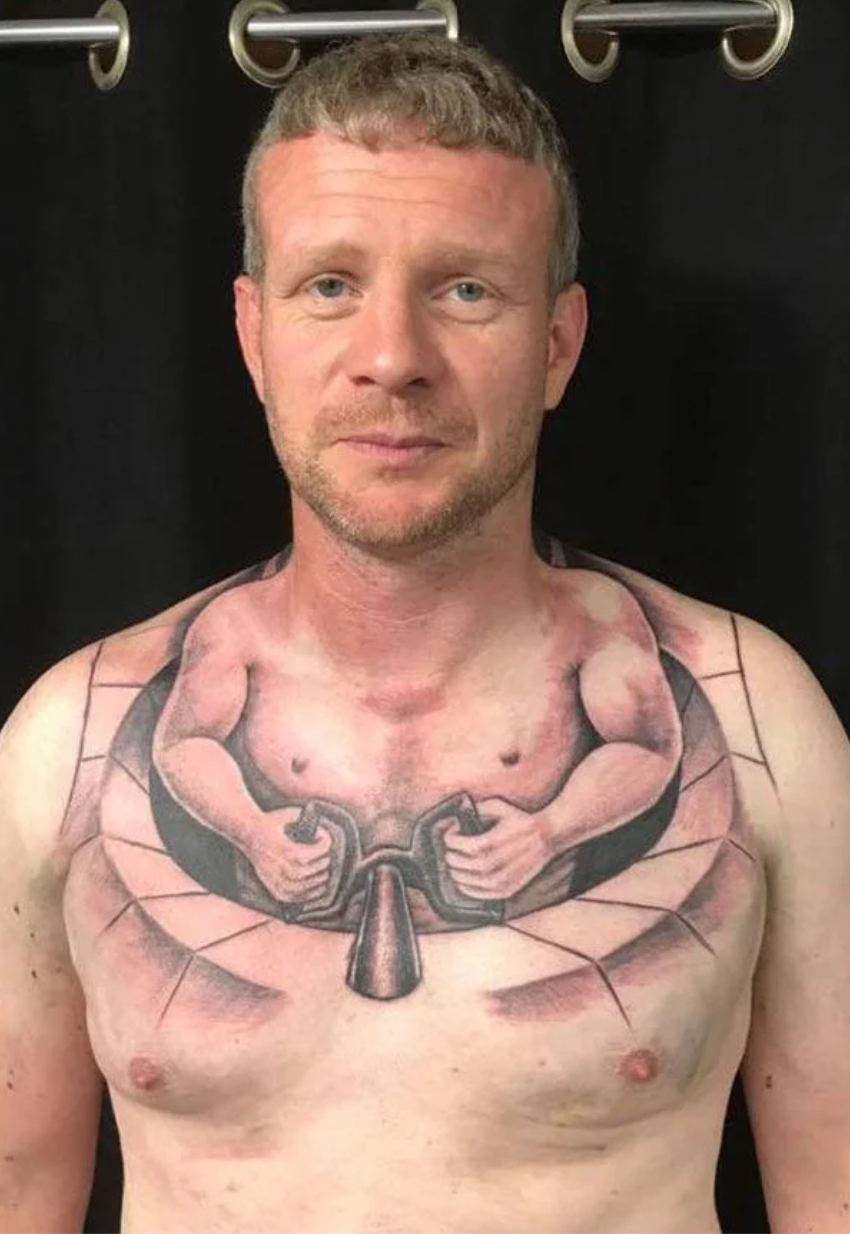
It’s hard to say for certain because there’s only like three pixels in this picture, but honestly that doesn’t look bad to me.
It’s at least well designed and executed at a technical level. I feel like the issue here is that its position, context, and presentation is trashy. Still, I see where you’re coming from. It’s possibly the best tattoo seen in this community.
Everything about this image is confusing
At least she’s got a cap on so she doesn’t get cold.