
From the other place: https://www.reddit.com/r/space/comments/1dmibwd/this_is_my_most_advance_moon_photograph_ever_it/
Pics too good to miss. :)

I don’t know anything about moon pictures, my best attempt was not great
But how did they composite 81,000 images without worrying about atmospheric lensing distorting the proportions as it moved across the sky for 4 days? Is it just negligible?
They didn’t. What they did was take 81,000 images and then filter through, them taking the best images of each region of the Moon and then averaging and compositing those.
It isn’t 81k images stitched together. It’s 81k images taken in the hopes of getting enough with perfect clarity to create the composite.
With all the impacts the moon seems to take, is there any footage of a new crater being made? That would be super cool to see.
Here you go! First time seeing this footage myself!
https://youtu.be/000iTCoEE1s?si=mKO_1XCDVLYS-Yqk
I seem to recall a story about a large impact visible to Europe from Earth sometime around the renaissance as well, but I couldn’t find it.
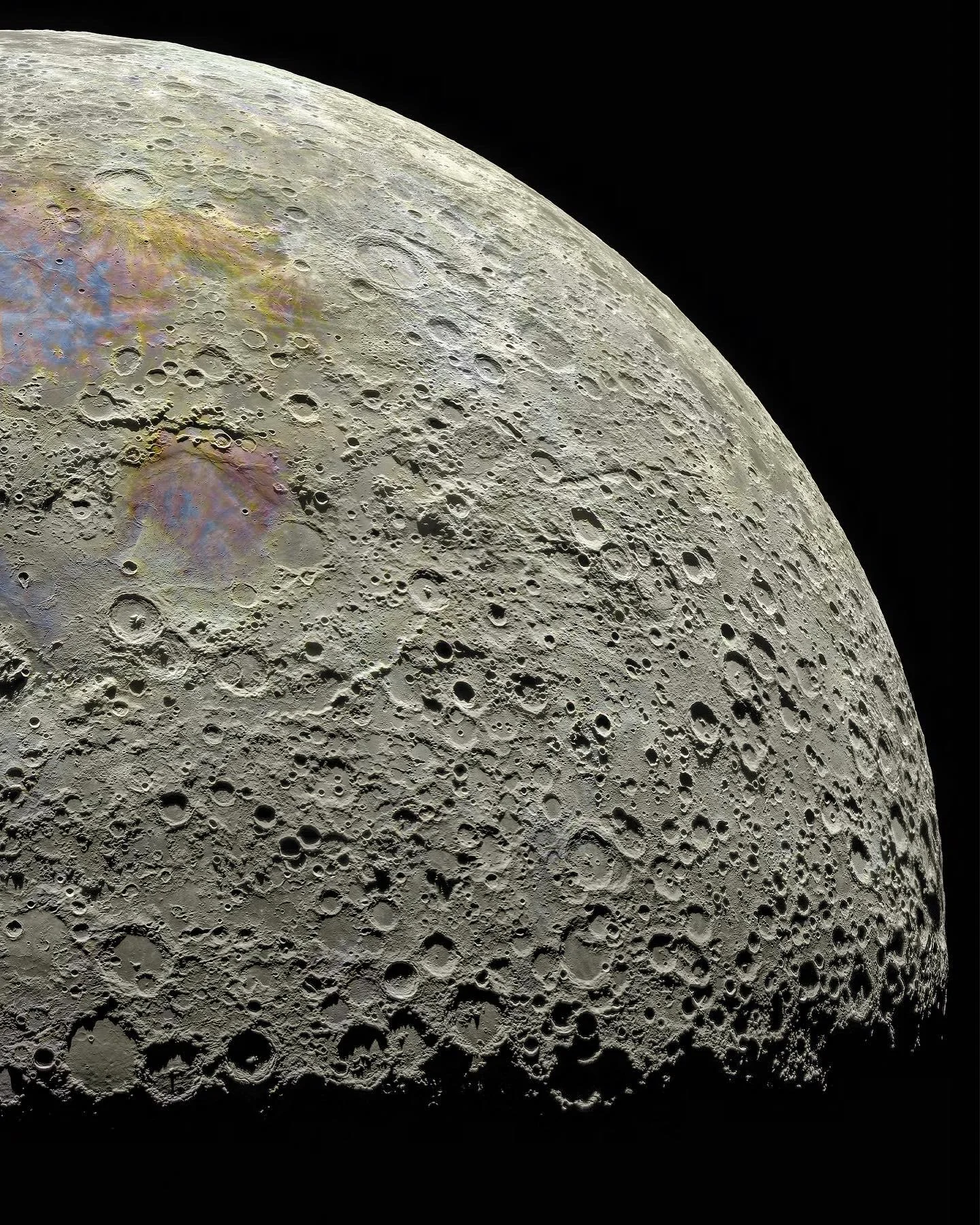
What is it with the blue/violet/red-yellow stuff?
Is this some metallic thing?
Knowing what I know, I am assuming this image was standardised and then normalised (fancy stats algos to keep things in the same visual range) while stitching it together, and the final product enhanced a lot of colouration (saturation). They’re subtle or undetectable to the naked eye, but they exist. They are reflected in the different minerals present. I’ve done this stuff (raster stitching) with different imagery. Op was active in the comments with info, but I didn’t read up on it.
Pasted from the Reddit thread:
The colors don’t match what a human eye would see, but without going into a philosophy tangent, color is extremely complex and a huge part of what a human sees is your brain doing representations and mapping that isn’t perfectly represented in the physical object being observed. In this photo the saturation has been increased (versus a human eye) because it helps show the geological differences on the lunar surface. The reddish areas are high in iron and feldspar, and the blue-tinted zones have higher titanium content. Instead of thinking of the color as “real” or “fake” it’s probably better to think of it as a tool, to simulate if you were a super human with the ability to adjust saturation and detect metal composition with your eye. Usually when a photo like this is shared by researchers and scientist all this nuance and exposition is included, but then journalist and social media get a hold of it and people start crying “fake” without an understanding of what the image is trying to accomplish. TL;DR - The image isn’t what a human eye would see but it isn’t just art to look cool, the color and modifications have physical meaning and serve a purpose.
Excellent explanation. Appreciate you sharing it!
Wow. The level of writing failure in the headline is ALSO astronomical.
It’s… beautiful.
Quick! Someone tell Markiplier about this! (He hates the moon.)
Linking to Reddit kind of defeats the purpose of using Lemmy.
At least they posted the source
Yes. However, we shouldn’t be sourcing content from Reddit at all.
I disagree. I welcome OC content like this.
It’s not OC. If it was, OP wouldn’t have had to link to Reddit to share it.
