I repeatedly wonder wher the toggle switch comes into play here. Is it more intuitive than a on/off checkbox? Often these things still only have one label (and not one for each state), so where’s the difference?
No, fuck these. Especially when you have to actually click and drag them. Even more especially when it isn’t obvious whether it is on or off. Check boxes inherently lack the issue of colour blind difficulties too.
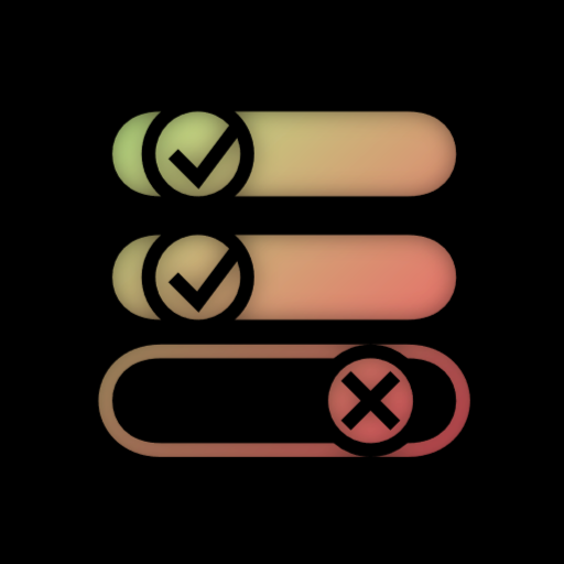
The background (green in the image) is usually a darker shade than the knob. That’s how you can tell the moving thing apart from the depressed background even if you’re color blind.
Edit: Just realized that that wasn’t the point… Thanks, downvoters!


I repeatedly wonder wher the toggle switch comes into play here. Is it more intuitive than a on/off checkbox? Often these things still only have one label (and not one for each state), so where’s the difference?
Any opinions here?
No, fuck these. Especially when you have to actually click and drag them. Even more especially when it isn’t obvious whether it is on or off. Check boxes inherently lack the issue of colour blind difficulties too.
Huh? That exists? I didn’t think I’d have to specify that a toggle should work in a non what-the-fuck-are-you-actively-trying-to-repel-me way
With the wrong color scheme its really hard to know if its’ ON or OFF
And some people are color blind
The background (green in the image) is usually a darker shade than the knob. That’s how you can tell the moving thing apart from the depressed background even if you’re color blind.Edit: Just realized that that wasn’t the point… Thanks, downvoters!