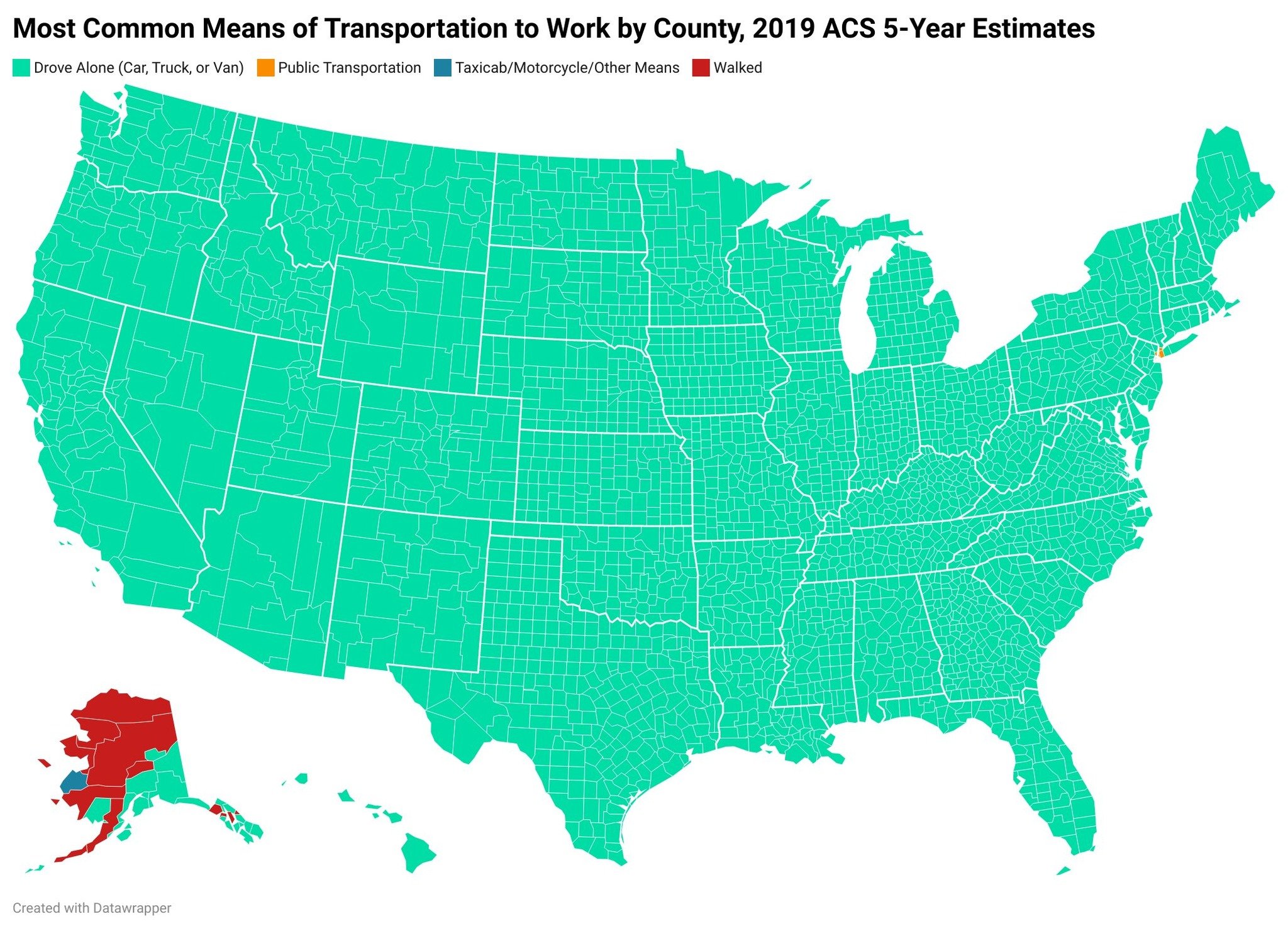
I think this map would really benefit if the colors would be slightly adapted to show the percentage. In some regions, 50% commute by car, in other regions maybe 90% - and both are green.
It really highlights the fact that most of us (also in europe) depend on our cars to make a living.


I think this map would really benefit if the colors would be slightly adapted to show the percentage. In some regions, 50% commute by car, in other regions maybe 90% - and both are green.
It really highlights the fact that most of us (also in europe) depend on our cars to make a living.