Bottom only in bedroom
Definitely the top, otherwise I am misclicking the tooolbar.
But also, I am mostly a landscape smartphone user. Which is why I’d prefer 16:9 instead of whatever the hell this wide thing is. But with bezels. You can hold onto a bezel with thumb. Also a separate navigation button like I had on my Moto G5s Plus 🥰.
Landscape
Phone
You’re a monster
Also permanently enabled Desktop mode on browser.
But I also increased minimum width in developer settings from default 395dp to 705dp. 600dp and above is considered a tablet by apps. Fits so much content on 1 screen.
Is it comfortable? From my experience landscape suffers from issues like the ui taking up a lot more screen space and the keyboard being hard to use.
That depends on what apps you use. But for example YouTube app in tablet mode looks nicer in landscape:

In phone mode you can only view comments/live chat in portrait mode.
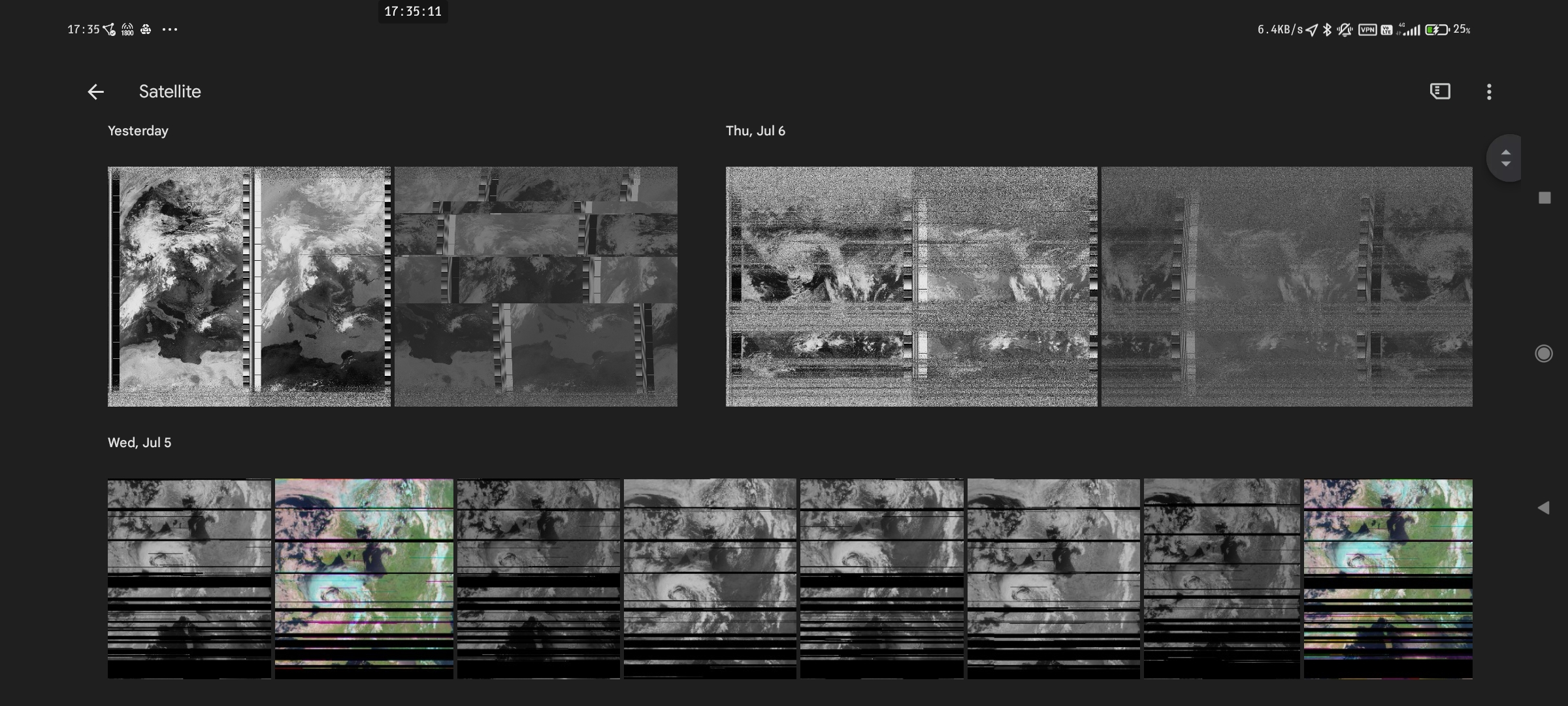
In tablet mode, this is often the other way around. Some comparisons:
Google Photos
Phone mode:
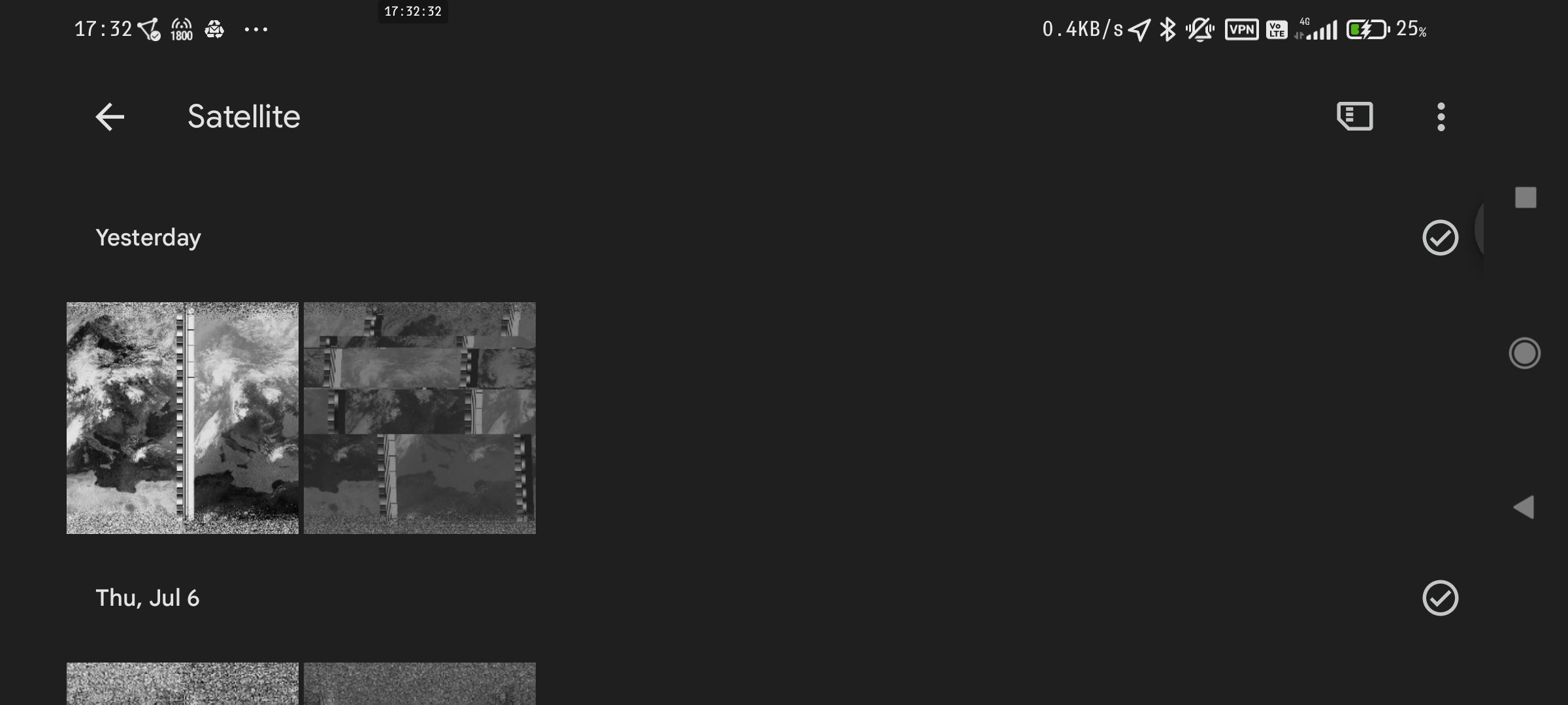
Tablet mode:
YouTube
Phone mode:
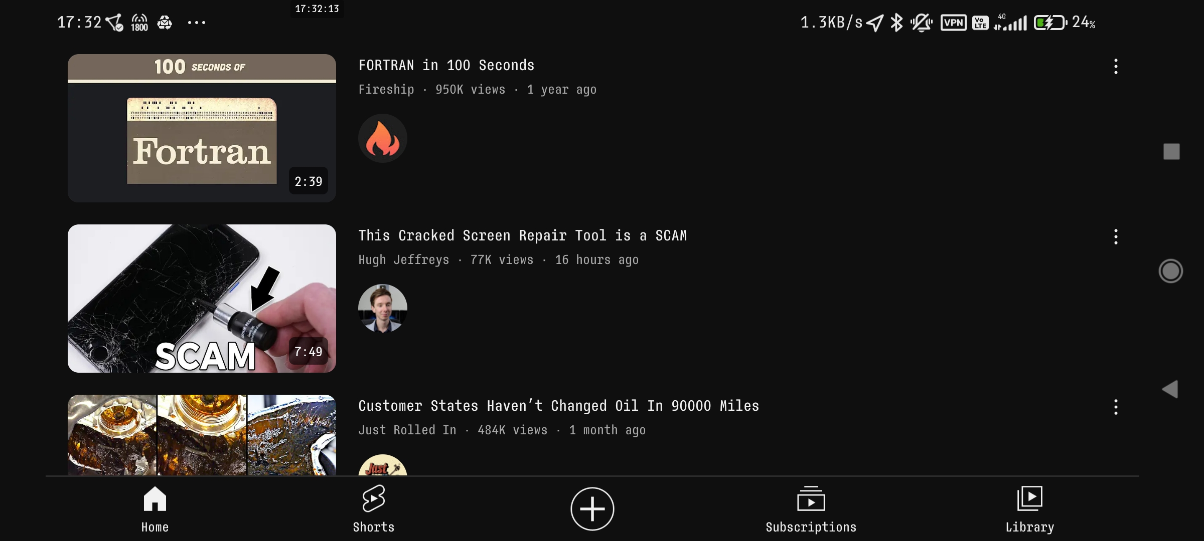
Tablet mode:

Google Mail
Phone mode:
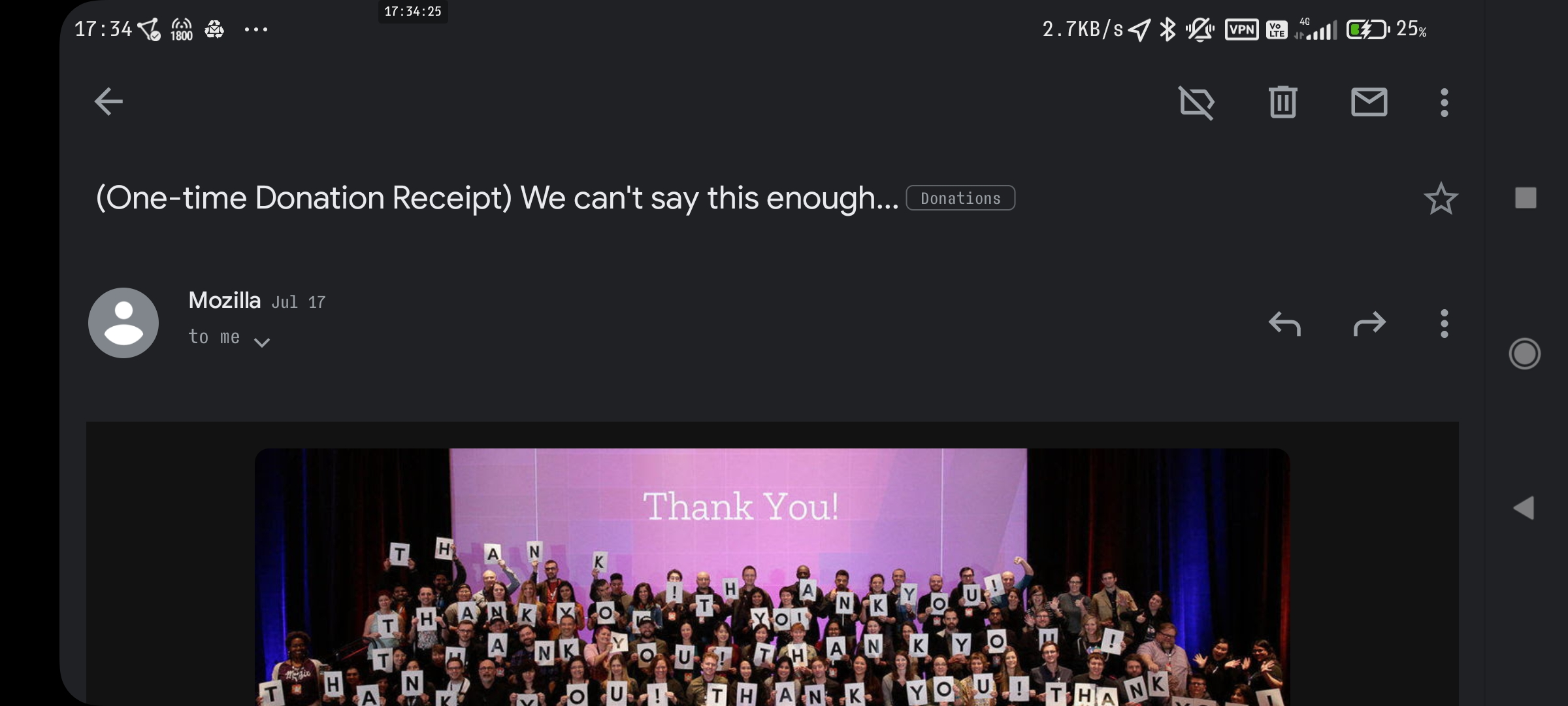
Tablet mode:
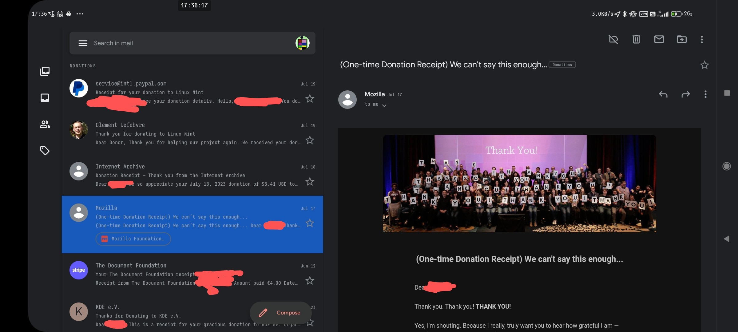
etc.
I mean, if your phone is a >6" monster, tablet mode makes sense… (I can’t stand modern phones without replaceable batteries, bezels and a tactile Home button)
6.67", to be precise.
I think all phones above 6" are oversized. I would prefer a >5mm thick 5" 16:9 phone to any made today. I use a 5.4" phone and I’m still a Firefox bottom.
Top. Always top. That’s where all the tools I need for an application should be. Bottom area is for system tools.
It keeps things nicely separated, less risk of fat fingering something I don’t want to hit.
system tools
Not if your phone has hardware buttons
Bottom because phones are way too big to comfortably reach the top at all.
I would only use top on a <4" phone. Currently using a 2017 Samsung J530F with a 5.4" 16:9 screen (significantly lower than most made today)
Top: phone, desktop and in the bedroom.


