

- cross-posted to:
- linux@lemmy.ml
- freesoftware@lemmy.zip

- cross-posted to:
- linux@lemmy.ml
- freesoftware@lemmy.zip
You must log in or register to comment.
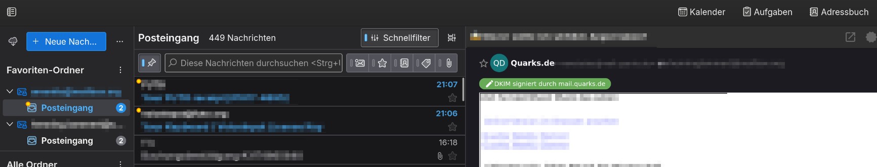
Okay one criticism: the UI density “dense” is too dense and squeezes the text. So I use the normal mode.
Meanwhile, unlike KDE Plasma 6, Thunderbird added more unneeded barriers.
Also, the message “bubbles” are not cut off at the bottom limit where the content ends, but have a random space below left. This means you need to scroll more.
The star instead of the yellow dot for “new” wastes space.
Old:
New:
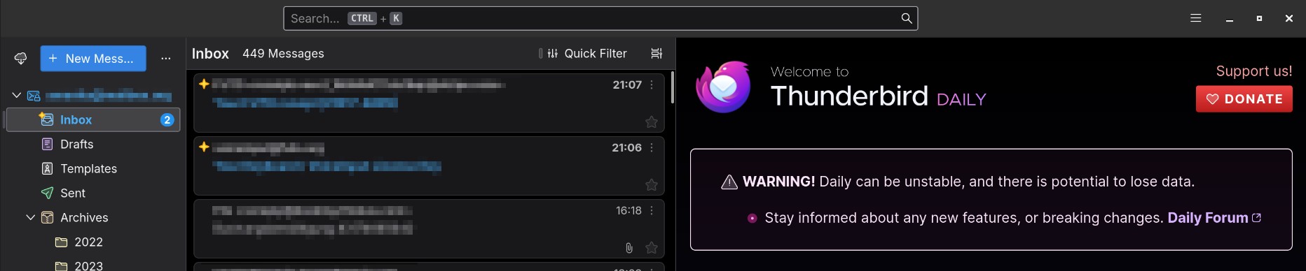
These are not dealbreakers, but still, why??
Also as you see I use the quickfilter search. It would help a lot if it could be added to the top panel, which has lots of empty space.
I’ll be honest, and forgive me I don’t have a horse in the desktop race, but the newer is much better. It’s cleaner with logical lines and margins that mean it doesn’t feel cluttered.
Really excited!
I use the unofficial Thunderbird Daily Flatpak and test it that way often.
The background code changes are really really nice.
The UI… I dont know. The sidebar is still useless and not a replacement for Tabs. Everything got even bigger, and TB Coversations is still better than their Threads implementation I think.
But I have to look at it again.
Would be cool to have a stub mail account to test it with, but I just use my main one with IMAP.
I stopped caring about Thunderbird a long time ago, but when Thunderbird Sync was announced, I began to reconsider. I loved what I saw of the desktop redesign, but was super excited for Thunderbird for Android. I’m happy for the progress they’re making, especially since said changes are pleasing for your user experience.