

- cross-posted to:
- anticorporate@lemmy.giftedmc.com
- cross-posted to:
- anticorporate@lemmy.giftedmc.com
You must log in or register to comment.
The market has solved it.
You just don’t realize what the market has solved for. It didn’t solve the problem of expensive healthcare, it solved the problem of how to maximize profits for the wealthy.
That’s what people don’t understand about “the market”. What you think it’s doing isn’t what it’s actually doing.
If the free market had any real competitors, the problem would genuinely solve itself in favor of the consumer. We see this with any new tech where a bunch of new firms try to win customers by any means necessary in those first few years.
The problem as always is: where are the competitors after X years, and are these “competitors” actually competing anymore?
The solution as always is: regulate. Ensure competition. Ensure cartels aren’t price fixing. But no one wants to hear that
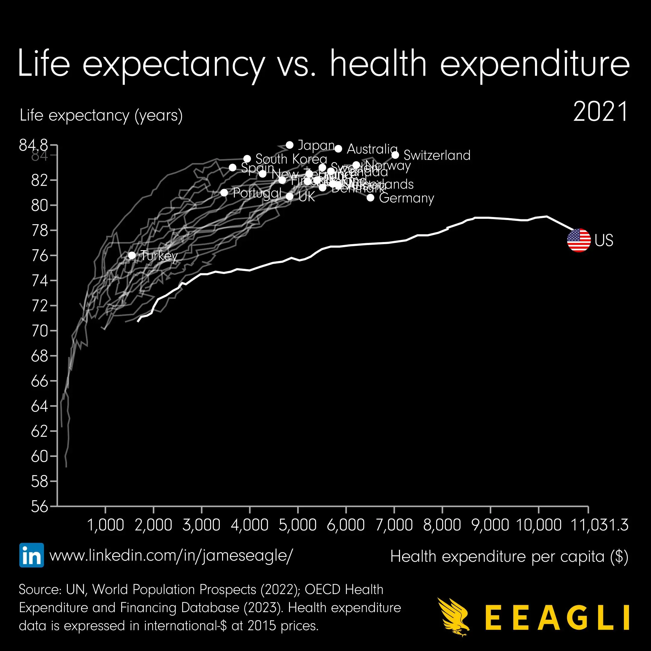
I have an honors minor in medical humanities and took several medical policy courses. We looked at this exact graph from previous years as well as several other huge sets of data/graphs/studies and anything else related to insurance you can imagine. Insurance is not a standard market commodity and does not follow the same trend or logic. The only way you can lower premiums in insurance is by reducing the risk in the pool, or increasing the pool size to dilute the risk. This is either increasing the total pool size by increasing premiums, getting more people, or being selective about who joins the risk pool. The third one was what was called “preexisting conditions” and kept high cost people from entering the risk pool and draining the funds. This got banned and increased premiums. By increasing competition you end up splitting up the pools, making everyone’s premiums go up. This happened multiple times post ACA after the GOP started stripping out the funding and safeguards to prevent this. More and more competition opened up with artificially low premiums being subsidized by federal dollars, but then when the subsidies ended the premiums started jumping. Then when the premiums were jumping, new companies opened up to make more competition advertising lower rates, but then further fractured to pool sizes, leading to premiums skyrocketing. If you look back just 10 years ago there was a 3-5 year stretch of premiums increasing almost 30% year after year. It was due to all the competition opening up every year. This is why single payer systems have the lowest rates. If you have even one private company monopoly with a regulated cap on profits you would still end up with lower premiums. Then, if this single paying company was nationalized to take out the profit making middle man, the premiums are that much lower because your risk is spread across a massive pool. More competition in insurance makes the problem worse. I would agree with your stronger regulation though. There is a lot that can be done there.
Thanks for your insight!
I would really like to know how this graph was generated, because some expenditure per capita values have three different corresponding life expectancy values. Just look at Spain for example.
…how did the line come about? How did they determine what the life expectancy would have been with less expenditure per capita?
There is a minimum amount which is likely the least some people spent on their health. So there is no interpolation I can see.
That doesn’t make sense unless this was personal expenditure, which it doesn’t seem to be
At least one of those lines goes back on itself at some point, so my assumption is that it’s tracking where each country has been over time.
Ooh good catch. That makes sense. Not sure I would call this beautiful, especially without any way to tell how much time has passed, but fair enough
My guess is that this was a gif at some point and the line is historical data
Definitely, you can see some lines in the top left zigzagging back left, which would not be possible if each was a function of the x-axis. In fact, both axes are a function of the hidden z-axis, which is time and comes in discrete yearly steps, the latest of which (2021) is highlighted.
I think the line might be historical data?
But… from when? Surely expenditure hasn’t gone up linearly with time


